Wednesday, June 10, 2015

Final Exam

 4. 
 
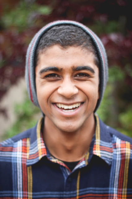
This photo would be my transformative photo. Before this photo, I was more comfortable with taking pictures of still life and objects rather than people. After taking this picture, I realized I actually really enjoyed taking portraits of people and talking to them while taking their picture. My view of photography changed from thinking oh photography is basically just pretty pictures to that photography is a way to connect to people and learn their stories and share them through a picture, because a picture is worth a thousand words. Even though this photo doesn't quite tell a story, process of getting the photo is what changed my view.

5.   The difference between shape and form is that shape is basically like the 2 dimensional outline of an object, whether its a circle or square, while form is more of the 3 dimensional shape of an object and has depth. So the picture in my post for shape shows many different shapes in the picture, such as the oval shape from the leaves to the lines for the flowers while in the picture for the post about form, the flowers are spheres.

6.    The difference between pattern and repetition is that repetition is the repeating of a pattern throughout the whole picture to bring unity. The picture depicted in the post about pattern is just a pattern of lines that are on Haroon's shirt. In the repetition picture, it utilizes the line pattern and repeats throughout the whole picture.

7.    My about page on weebly. Inspirational about page Richard Bernabe.

8. Our last three projects were the commercial shoot, garden photoshoot, and our one-word project. Out of these three, our best one would be our final project, the one-word project. I believe this is our best work because each picture tells a story about each person we took a picture of, through their pose and their quotes. This project really taught us how to communicate with our subjects while taking the pictures. It changed me by making me less shy about asking others more about themselves and asking them to pose a certain way. I learned to see how important communication is in photography to get a good photo with a story.

Monday, June 1, 2015

Student Website Reviews

First Period: Aileen Hsu
I believe that her best picture would be the one where this girl is pretending to walk up the stairs drawn on the ground. I think it's her best picture because its a unique picture that has a lot of entertaining elements and that its taken at an interesting angle.

Second Period: Estell Kim
I believe that her best picture is the one where two girls are laying on the ground and laughing. I really like how this picture is taken from above and really shows the joy on their faces and that theres a lot of color in this photo.

Third Period: Aarti Panda
I believe that her best picture would be the picture of her phone taking a picture of a walkway between two houses. The picture utilizes the concept of lines, drawing your vision down the middle of the photo.

Thursday, May 21, 2015

Garden Photoshoot


Haroon holding a plant in his hands


tray of sunflower buds

M.C. looking at a plant in the garden

Cara modeling in the garden


Haroon smiling in the garden

Friday, May 8, 2015

First Commercial Shoot - Forever 21


photo taken and edited by Haroon:

photo taken and edited by Cara:

photo taken and edited by M.C.:

inspired by Chris Hunt Photography for Forever 21
his blog

Wednesday, April 29, 2015

Dave Hill Inspired Photo

Original:


Edited:

- cropped the picture
- exposure (+0.15
- blacks (-13)

Fun with photoshop:


Wednesday, April 22, 2015

Photo Story - MCW


1. The start of setting up the booth for green club


2. Green club with their table and tent set up with posters attached


3. Green club setting up their cups of sorbet to sell


4. Green club selling sorbet during lunch


5. Green club cleaning up after lunch


Monday, April 20, 2015

Story With a Photo - Focus

"Haroon look this way!"
"No stop taking pictures of me!"
"Stop running away from the camera Haroon Adam Rasheed."
"Fine. I'm gonna keep moving my finger so the camera can't focus and then it can't take a picture."
"Damn you Haroon."

Despite his valiant efforts to avoid a picture being taken of him, the camera still managed to focus on him and snapped a shot.


Wednesday, April 15, 2015

MSJMCW Story

As soon as the lunch bell rings, there is a stampede of students heading towards one common goal, the horseshoe. During Multicultural Week, the different clubs of Mission San Jose High School sell a variety of food in their respective booths. As for the upperclassmen who can drive, they head towards the parking lot to make the most of the extended lunch to get food that they normally don't have enough time to get. Because most clubs need to make a profit to fund their club, the food they sell are generally over priced. Therefore, broke people like me go out to eat more reasonably priced foods instead. This week, I have gone out to places such as the Prolific Oven, Supercue, the Habit, and today we are venturing out to Chick fil A'. However, on Thursday I will be selling samosas for yearbook.
After Homecoming week, Multicultural week is the second most looked forward week that students look forward to. There are hour long lunches from Monday to Thursday and on Friday, we have an assembly where students perform an assortment of different dances, such as hip hop, Bhangra, Bollywood, ballet, Chinese dancing, and many more. Being a senior this year, this is my last Multicultural week and I can truly say this and Homecoming are going to be some of the few things that I will miss about Mission San Jose.

Principles of Design - Unity

Original:


Edited:


- exposure (+0.45)
- blacks (-8)
- cropped the picture

I chose this picture for unity because the repetition creates a sense of unity within the picture, that al the peeps are a part of one.

Principles of Design - Variety

Original:


Edited:


- exposure (+0.60)
- blacks (-25)

I chose this picture for variety because of the many different objects in the picture, which draws your eyes around the various aspects of the picture.

Principles of Design - Rhythm

Original:


Edited:


- temperature (-3)
- exposure (+0.25)
- blacks (-15)

I chose this picture for rhythm because of the repeated use of lines in the rock, which creates a feeling of organized movement.

Monday, April 13, 2015

Principles of Design - Proportion

Original:


Edited:


- lowered temperature (-3)
- increased exposure (+0.45)
- enhance the black (-8)

I chose this picture for proportion because Mr. Farley is beautifully proportioned!! The proportion in the picture unifies all the elements.

Principles of Design - Emphasis

Original:


Edited:


- lowered the temperature (-8)
- increased exposure (+0.45)
- darkened the blacks (-6)

I chose this picture for emphasis because the focus is on the safety cone in the front while the ones in the background are blurry.

Thursday, April 2, 2015

Shutter Speed and Everything After

Partner: Melissa Cai

1. I believe the photo was taken with a fast shutter speed because the trucks are on a highway, and so we can conclude that they are moving quickly down the road and because there are no blurry figures in the photo.

2. I believe this photo exhibits one of our rules of composition, simplify. The photo in itself is very simple, it focuses on the trucks on the highway and there are no other distracting factors.

This photo uses the rule of depth very well. There is a sense of depth conveyed through this photo, as seen in the close up trucks and faded out, far away trees and hills. Even though the main subjects of this photo are trucks, one can still see the background and the seemingly never ending road.

3.An element of art that applies to this photo is space. Space is the area between and around objects, and in this photo, it creates the feeling of depth. The seemingly empty space in the sky and between the trucks contributes to the depth of field and gives the picture a more dynamic feeling


4. One of the principles of design that this photo utilizes is movement. The center divider is the main focus of the picture but the lines in the picture directs your vision to see the trucks.

shutter speed: 1/250

Friday, March 27, 2015

Lens Blog - Variety


The photo that has the most variety on Lens album "Documenting the Blues" is this one.

There is so much action in the photo. There are pots, buckets, woods, tires, blankets and boxes. Your eye is drawn to many different things which adds to the variety of the photo. There is so much happening - which makes it, in our opinion, have the most variety.

Tuesday, March 24, 2015

Half Past Autumn - Part 3 & 4

1. What is your definition of successful?
          My definition of being successful is doing something you love for the rest of your life, and for                 me I haven't found that passion quite yet but when i do, that's when I would consider myself               successful.

2. What have you given up to become successful?
           I've given up a lot to try to become successful. I given up friendships, relationships, short-                        term happiness, hangouts - a lot of things. It's worth it to me though. It's worth it to me.

3. What did Parks give up to become successful?
           Parks gave up much of his family time with his wife and children.

4. .Who was Genevieve Young's father?
           Her father was one of the founding members of the UN and VK Wellington Kok.

5. How much was Parks advanced to write his first book (and eventual best-selling autobiography)?
           Parks was advanced 10,000 dollars.

6. How much money did Elijah Muhammad offer Parks to do a story on The Nation of Islam?
            5000

7. Why did Parks refuse the money?
           He did not have the same ideals as mah boi Elijah.

8. What was significant about the movie The Learning Tree?
           First time in Hollywood history that an african-american had directed the movie

9. What was significant about the character Shaft?
            It was the first black superhero. It was their role model and idol to look up to.

10. What was Gordon Parks' choice of weapons?
            His choice of weapon was a 35 mm camera.

11. What reason did Genevieve Young give for the divorce?
            It was like living in a washing machine. They rarely saw each other; the phone was constantly                 ringing; the whole marriage had degraded to a few visits now and then.

12. In 1984, Parks directed Solomon Northrup's Odyssey. What recent feature film told the same story?
            Twelve Years a Slave

13. Who was Gordon Parks, jr?
             He was Gordon's son who died in a plane crash.

14. What is your favorite Gordon Parks photo?
             My favorite Gordon Parks photo is the one with the maid with the broom and the mop in                            front of the American flag. American Gothic is my favorite photo.

15. What will you remember about Gordon Parks in ten years?
             I will remember his success, and how he went from nothing to almost everything.

Thursday, March 19, 2015

Elements of Design - Repetition

Original:


Edited:


- black&white
- increased contrast (+25)
- added vignette

I chose this picture for repetition because of the repeating lines on the garage door. This differs from pattern because this uses the repetition of the pattern in the picture.

Principles of Design - Pattern

Original:


Edited:

- added vignette

I chose this picture for pattern because of the repeating lines that are patterned on Haroon's shirt.

Principles of Design - Movement

Original:


Edited:


- lowered temperature (-7)
- increased exposure (+0.45)

I chose this picture for movement because the chandeliers along the ceiling draws your eyes towards the back of the hallway.


Monday, March 16, 2015

Half Past Autumn Pt. 3

1. How did Parks become a writer?

           He was told to write a book

2. How much was he advanced to write his first book?

           10 Thousand

3. Who was his editor?

           Mrs. Young, his third wife

4. In the 1960's, what story did Parks create for Life Magazine on Segregation in the South?

           Muslims

Half Past Autumn Pt. 2


16. When did the FSA shut down?

            The FSA shut down in 1946.

17. After Gordon moved to New York, what magazine did he shoot for?

            Gordon shot for the fashion magazine Vogue.

18. Who was the picture editor of Life Magazine when Gordon walked into the Life Magazine office?

            The picture editor was

19. What was the first major story Parks covered for Life Magazine?

            The first major story was on the Harlem Gang Leader.

20. Who were some of the artists that Gordon Parks mentioned influenced his work after he moved to    the Paris Life Magazine bureau?

            He was inspired by Picasso, (Moliere, writer), Prokofiev, Debussy, Bach, Ravel,                                         Rachmaninoff, Pablo Neruda and more.

21. How did Parks shoot fashion when he lived in France?

            He allowed the models to move around to get action, and he kept the model in focus while                       moving with the model.

22.Where was Parks' concerto performed?

            The concerto was performed in Venice

23. Who was Parks' second wife? (Who was her father? What did she do?)

            Parks' second wife was Elizabeth Campbell.

24. How old was Flavio de Silva when Parks met him?

            Flavio de Silva was twelve.

25. When did Parks meet Flavio?

            He met him in 1961.

26. Where did Flavio live when Parks first met Flavio and his family?

            He lived in Brazil in the slums.

27. How is Gloria Vanderbilt? Who is her famous son? Who are her ancestors?

            Gloria Vanderbilt is an artist. Her son is Anderson Cooper, the anchor of CNN news. Her                         ancestors are Vanderbilts (almost aristocratic), and her parents are Gloria Morgan and                         Reginald Claypoole Vanderbilt.

28. How did Vanderbilt describe their relationship?

            Vanderbilt described it as being a meeting with someone they knew from ages ago. They                       didn't have to act with the usual formalities of meeting a person in the beginning.


Wednesday, March 11, 2015

Principles of Design - Structure

Original:


Edited:

- increased exposure (+10) and contrast (+9)

I chose this picture for structure because of the architecture of the building that leads the vision to M.C.

Tuesday, March 10, 2015

Principles of Design - Balance

Original:

Edited:

- changed it to black and white
- photoshopped the figure on the right out

I chose this picture for balance because the three lines balance each other out creating a sense of unity in the picture.

Friday, March 6, 2015

Elements of Art - Texture

original:

edited:

- increased exposure (+4)
- added vignette

I chose this picture for texture because it shows the lines on the leaves and the fuzzy texture of the flowers.

Elements of Art - Color (Green in the Bottom Right)

Original:

Edited:

- increased the exposure (+3)
- lowered the temperature (150)
- enhanced the green (+4)
- added a vignette

I chose this picture for color because based on the twister color we were given, which was green in the bottom right. The green from the plants in the background is shown in the bottom right of the picture.